Certificate in Photography
Rhode Island School of Design

Photography is often described as equal parts science and art. Photographers help us see the world in new ways–documenting, representing, contextualizing and/or interpreting objects, people, places, situations or occurrences through distinct lenses. The core curriculum engages students in exploring the principles of design to construct considered, meaningful and impactful images. Subsequent learning includes focused technical learning and practice with a camera: seeing through a lens, digital technology, lighting and post-processing. Students in the photography program are able to depict powerful visual narratives–building portfolios that support professional development, personal fulfillment and/or subsequent independent practice.
Drawing Fundamentals I
Drawing Fundamentals II
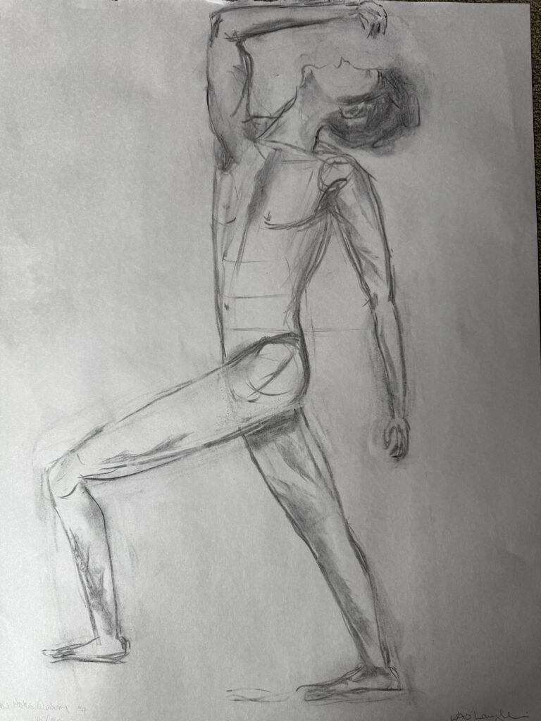
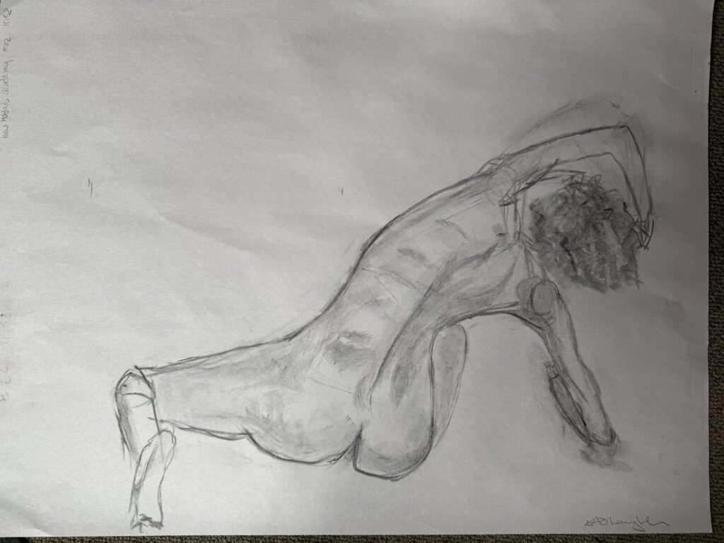
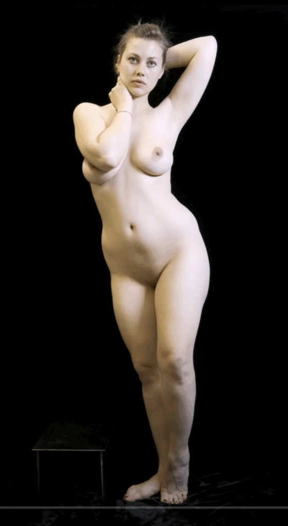
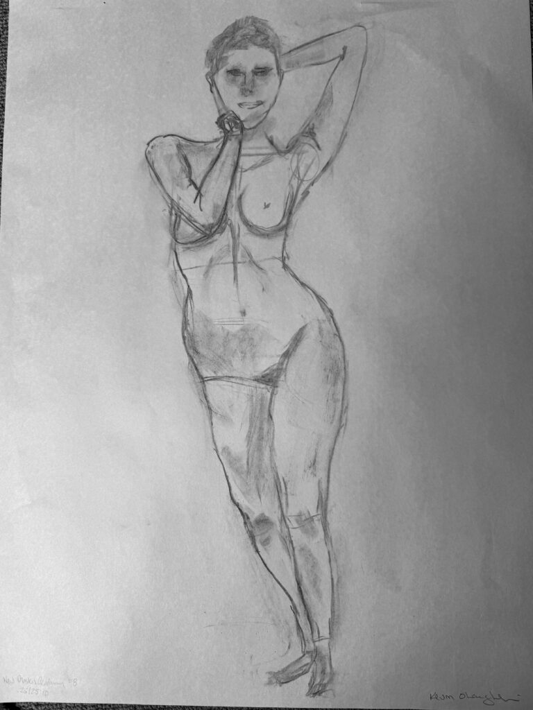
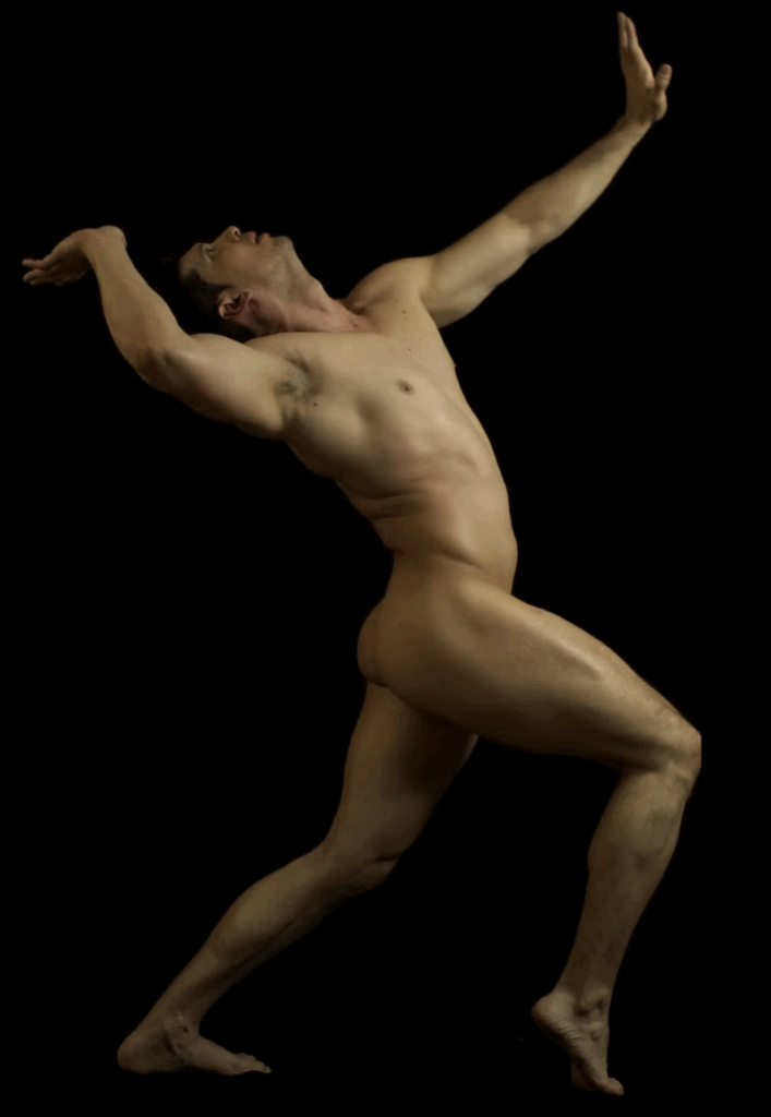
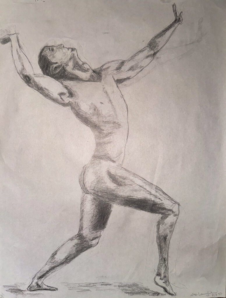
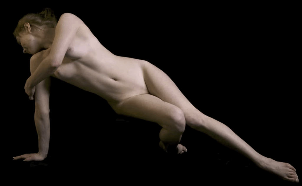
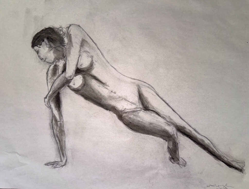
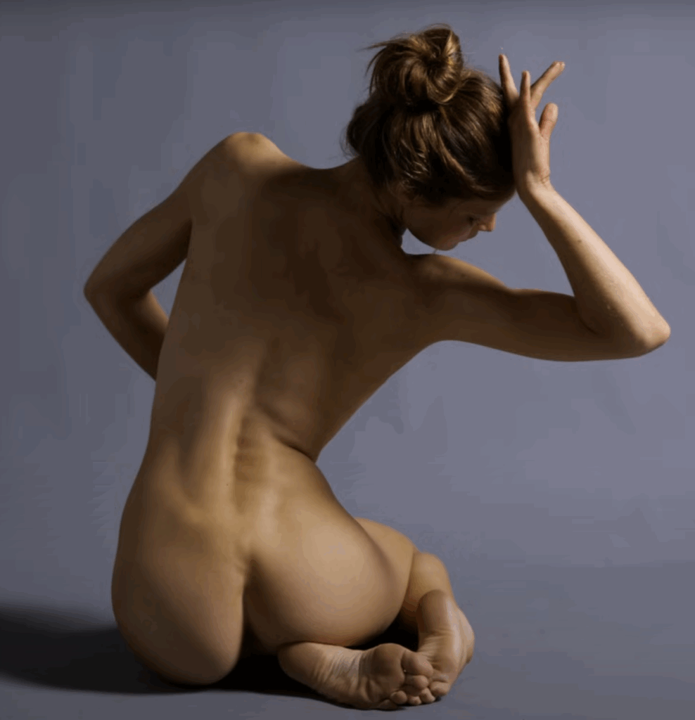
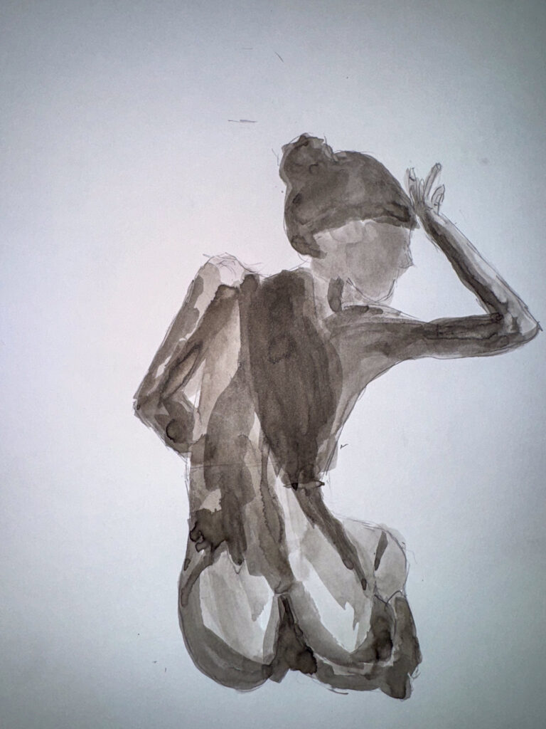
Submit 3 or more images of your figure drawings this week. You should have completed 6 drawings in total, with 2 drawings in charcoal, 2 in graphite, and 2 in ink wash. Choose 3 of these that your are particularly proud of in the medium or mediums of your choice. Always feel free to add additional images and any commentary you feel is relevant to your work this week.
Submit 3 or more images of your figure drawings this week. You should have completed 6 drawings in total, with 2 drawings in charcoal, 2 in graphite, and 2 in ink wash. Choose 3 of these that your are particularly proud of in the medium or mediums of your choice. Always feel free to add additional images and any commentary you feel is relevant to your work this week.
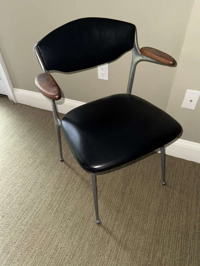
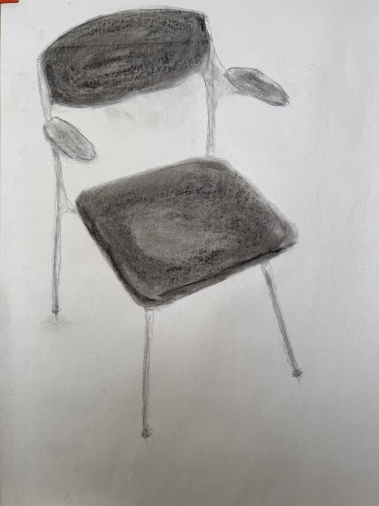
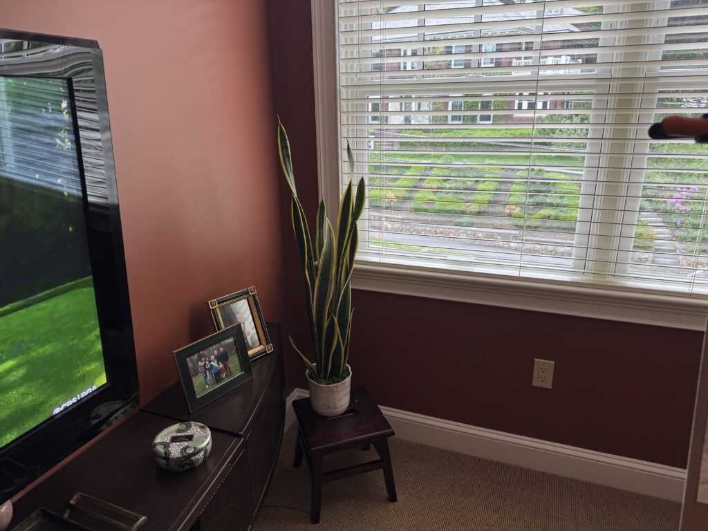
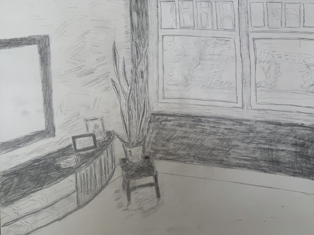
Submit 4 images total for this weeks drawing assignment:
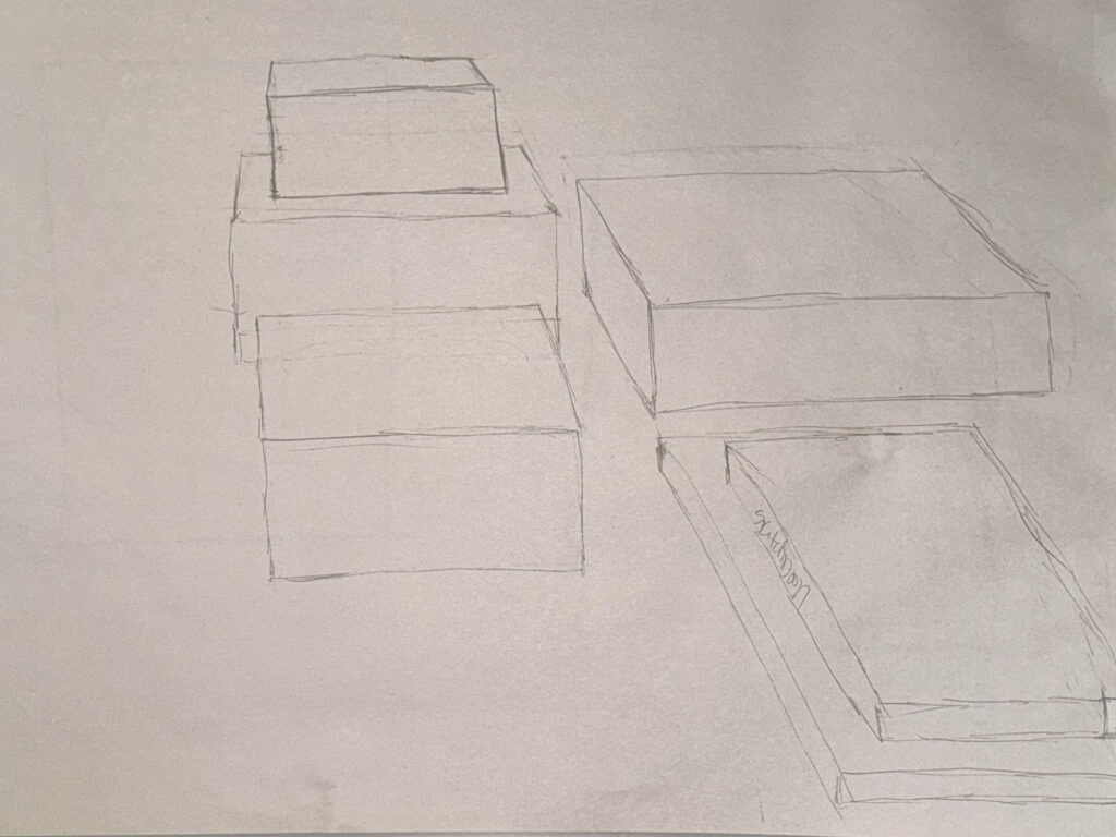
- 1 image of your drawing of a piece of furniture (chair, bookcase, small table, etc.) in 3 point perspective.
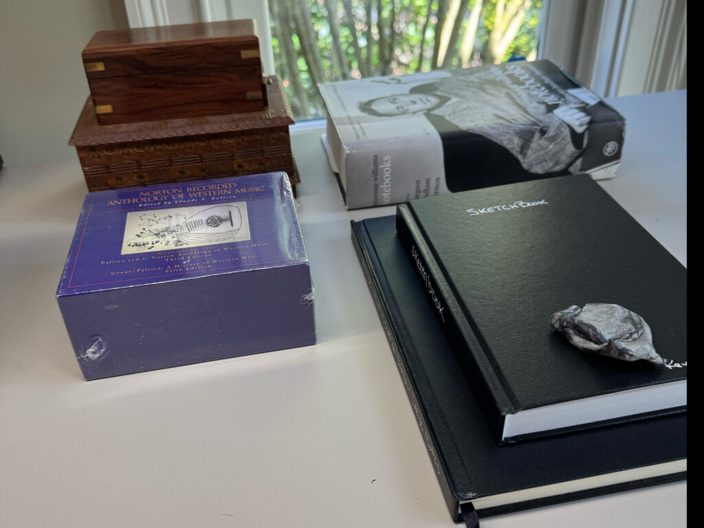
- 1 image of your subject for this drawing from the same vantage point for comparison.
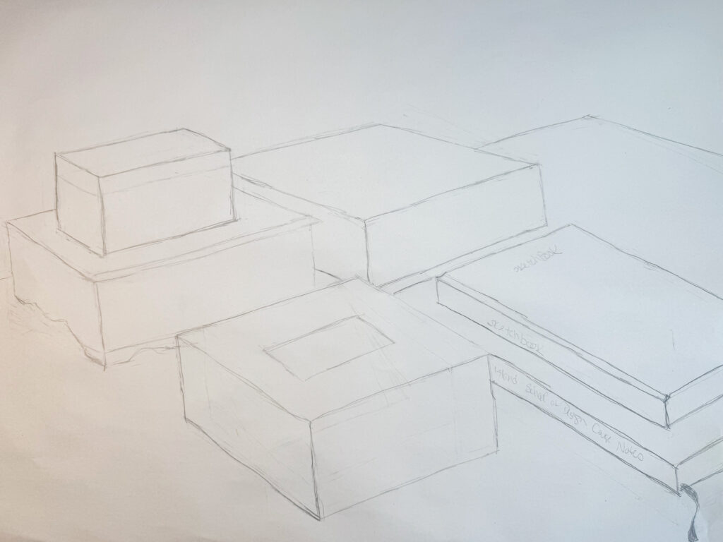
- 1 image of drawing of a large object or piece of furniture incorporating value and perspective to describe the room around it.
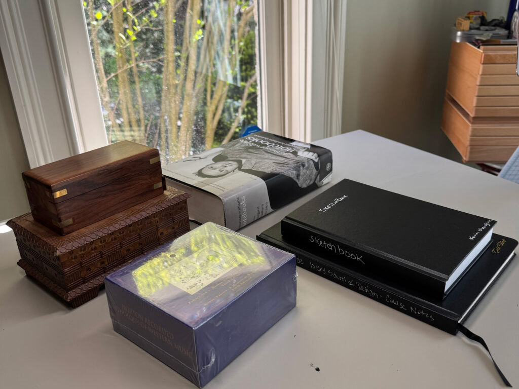
- 1 image of your subject for this drawing for comparison.
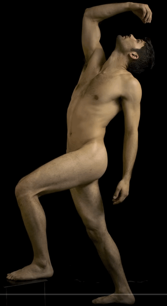
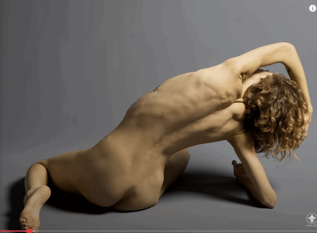
Create 1 drawing copying a figurative masterwork and 1-3 drawings depicting a large space using the medium or mediums of your choice. Submit the following:
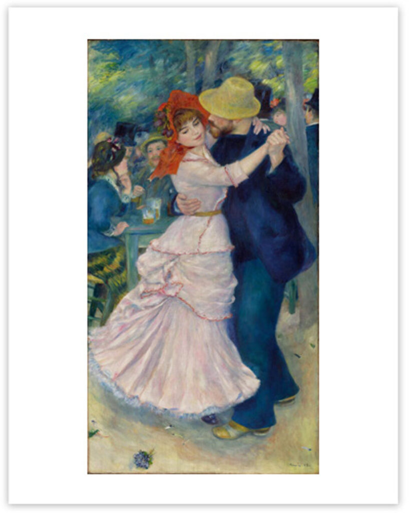
- One image of the masterwork you are copying (This can be historic or contemporary, bust must depict at least one figure)
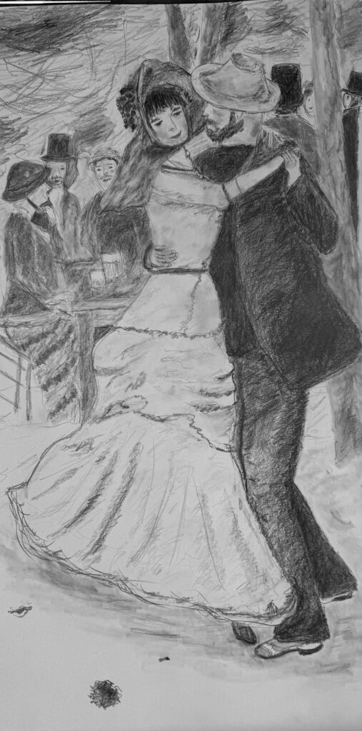
- One image of your master copy
- One or more images of your setup or source material (try to get as close to the vantage point you are drawing from as possible)
- One to three images of your completed drawings of a large space (you may use a photographic reference to guide you, but this should be done from observation as much as possible.)
Adobe Photoshop
-
Edit and repair 3 separate images that have been damaged by time and handling.
-
Choose your own images, never use practice images in assignments.
-
Antique images are often suitable, but recent prints can also work well.
-
Feel free to utilize family photos for repair and enhancement.
-
Be sure to work on layers above the original damaged image for quick comparison of before and after.


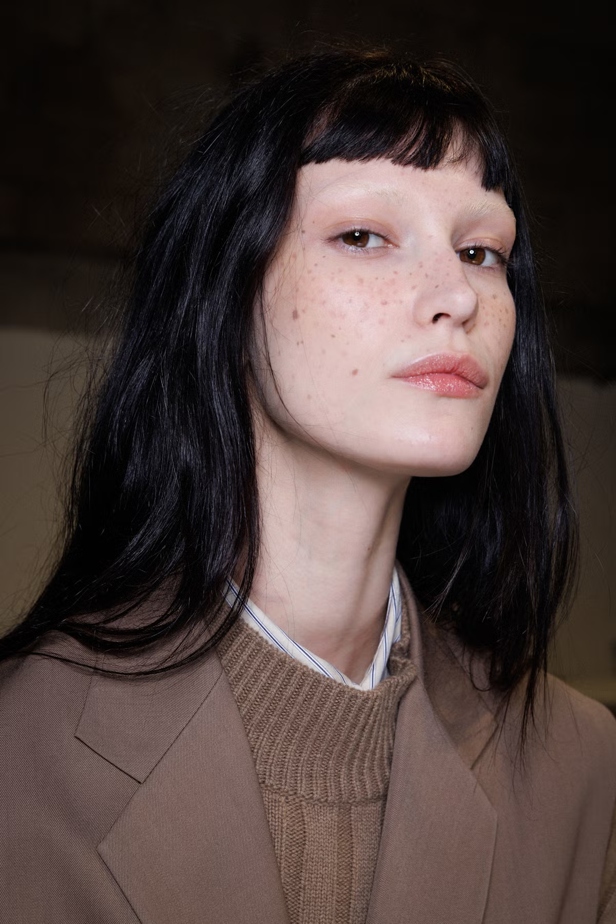
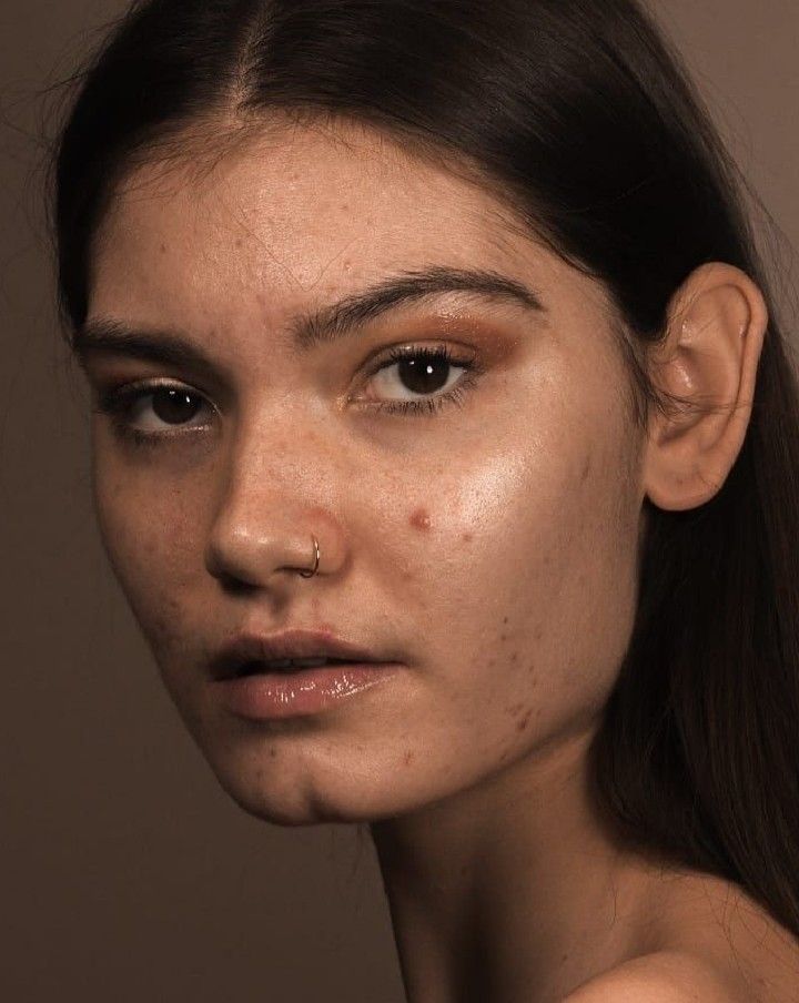
- Produce three before and after images showcasing digital make-up techniques as demonstrated
- Do not use practice images for the assignment. Always choose your own images from the Internet or your personal pictures.
- Blemish and stray hair removal, teeth and eye brightening, hair and eye color changes, skin smoothing, tonal adjustments, warping, and painted make-up application are all valid techniques for this assignment.
- The base layer or background should be the original untouched file for comparison.





-
Please produce three separate results where you have Isolated a subject in transparency utilizing layer masks, and modified the background and/or the subject to distinguish the subject from the setting.
-
The resulting image should make the subject more distinctive and more emphasized.
-
Color changes, blur filters, b/w-color composites are some popular approaches but any filtering or modification is acceptable.



The Digital Darkroom
Applied Color
Assignments
Find a color image on the internet or in a magazine. Make sure that you have a strong reaction to it. In other words, you should like the color usage or dislike it. Make sure that the image is somewhat simplistic. The example is on the complicated side. If you are in a certificate program it might be of interest to use an image in your field. For example, if you are in the interior design program you might use a picture of an interior. If you are in animation you might use a film clip.
Guidelines
- Trace or sketch a four-inch square part of the image. (Use trace vellum to trace an image. To transfer it you can cover the back of the image with graphite from a pencil. Then place the image face up on the Bristol Board and redraw it. An outline of the image will be transferred.)
- Determine and mix the values of each color in Gouache (achromatic B, W, G)
- Do not use any color in the translation.
- Paint the image on the Bristol Board
- Upload image to Translation Assignment
- Please repost your assignment in the Translation Project Discussion
The purpose of this assignment is to understand what happens to an image when the color intensity shifts.
The Process involves the re-coloration of a piece to contrasting images using bright and muted colors
Pick an image of your choice. The subject matter may relate to your specific field. Then:
- Grid off a two-inch square of the painting. (you may do the entire image if you like.
- Trace over the image twice and transfer it onto a piece of Bristol Board.
- Ignore the original colors. Use only the hues from the intensity scale you just created. Do not add any achromatic color.
- On one tracing create a muted coloration, using muted colors mixed from complements on the intensity scale. These colors are predominantly less intense. They tend towards the middle of the scale. Some bright colors can be used as accents.
- On the other tracing, create an intense coloration using predominantly intense pure colors. These colors are predominantly at the ends of the scale.
- A few muted colors may be used as an accent.If you are more comfortable working larger you can make the image larger.
In this assignment you will identify an image with a problem. It can be an artwork or design. The piece will be analyzed with the creation of a proportional chart. Briefly critique the image. Create a modified proportional chart correcting the problem. Recolor the original image using the modified color chart
Part One. Preparation
- Review examples of student work.
- Find an image in your chosen field that you believe has a color and design issue.
- Review the Color and Design Presentation.
- Review Proportion and Placement pages.
Part Two Creating a Proportional Scale
- Create a proportional color scale of the existing palette from bottom to top in paint or using paint chips.
- Make sure that each color is on a separate piece of paper so you can adjust the proportion.
Part Three Critique
- Write up a paragraph critiquing the color and design issues.
- Refer to the color scheme book from last week to see if the palette is harmonic.
- Look at the placement of the color.
- Decide how to modify the color palette and re-colorize the image.
Part Four Recolor
- Trace the image and transfer it to Bristol Board.
- Recolor the image with the modified palette material choice is yours, paint, colored pencils, computer etc.
- You may change the hue, value or intensity of the color.
- You may limit or delete hues.
- You may change the placement or the proportion of colors.
- Upload both the original and modified versions with the proportional scale.
The purpose of this assignment is to understand and explore the relationships between color, light and space. It is to learn how color shifts with respect to the time of day. It also focuses on developing inspirational palettes that can be applied to design
Instructions
Part One
Color Observation
This assignment involves several steps: choosing what to photograph at several times of day, developing palettes for each and creating a coloration of a line drawing in your field. You may choose your materials or use the computer.
Choosing what to photograph:
- If possible, outside in the natural light
- If not try to capture natural light through a window
Observe and take a photograph of the same image at three different times of day such as:
- Early morning
- midday
- evening
Part Two
Compare the three photographs:
- Compare colors of the images. Notice how different they appear.
- Create three distinct color palettes, one for each photograph.
Part Three
Apply one of the color palettes from above to a line drawing in your field of study or interest. Utilize the highlight shadow technique.
- Only one coloration is assigned. (You do not need to do a color study for all three times of day.)
Studies
Please choose one of the Painting Images and drag them to your desktop:
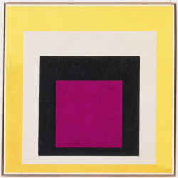
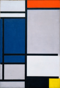
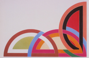
Please create a placement study by using the same palette but shifting the placement of the colors.
How this should be done:
- Please trace image and apply to Bristol Board
- Please match colors from painting
- Please apply colors in different locations
Using the sample clip by Frank Stella from his ‘Protractor Series’, I made several different color placement versions. Looking at his original, it was clear that the black protractor on the right attracts the eye there first, so I wanted to explore how to move the eye to a different location by moving the black protractor to the lower right. Then I explored inverting the light background to dark and reusing the black protractor to weight all groupings.
Part One
Please make a note of the following instructions.
Highlight Shadow Technique:
Use the complement as a shadow area instead of black to enhance your color design. Here’s a technique to create shadowed and highlighted areas in your drawings:
1. Choose three values of one hue: light, medium, and dark. If you’re using colored pencils, use closely related colors.
2. Choose the complement of the middle value.
3. Draw two one-inch by three-inch boxes.
4. Fill one box with the middle value of the first set of colors.
5. Add the lighter value on top of the original color to the top third of the box.
6. Add the darker value on top of the original color to the bottom third.
7. Add the complementary color to the bottom half.
8. The space that only has the medium value color is the purest in intensity and can be used as the highlight instead of white.
9. Integrate and smooth the spaces between blocks.
Part Two
Color and Light Studies:
For this study, it’s recommended to use colored pencils. Put a simple three-dimensional shape like a box, under a light source.
Study 1:
– Sketch in black and white while noting the shadowed areas.
Study 2:
– Trace or draw a line drawing of the sketch.
– Refer to your highlight shadow scales and choose a pair of complements.
– Use the same technique employed in your scales, choosing three values of one color.
– Cover the entire sketch with the pure color.
– Create a sketch where the most intense color creates the brightest highlights.
– Use the complementary color layered over the dark value for shadows.
– Use other mixed colors from the chart.
I chose blue hues for this assignment, with orange consequently the complementary color.
Photography I: Making Images (Part A)
Learn to make better photographs using a digital single-lens reflex camera. Through demonstrations, exercises, and individual assignments, you can expect to become more confident as you make technical and conceptual decisions. Each week we will learn about DSLR operation, processes and terminology. Whether your interest is in photography for exhibition, documentation, or personal growth, this course provides a solid foundation for further exploration.
Using a DSLR or mirrorless camera, make 10-15 pictures that look at the world in an unexpected way. Reflect on the spaces and people around you, and consider how they might be captured in a photograph differently than they are seen by the naked eye. Think about what it means to you to “look photographically.” Push yourself to explore or experiment in new and unexpected ways.
Using a DSLR or mirrorless camera, make 10-15 pictures that respond to one of the following prompts. While shooting, pay close attention to your composition, framing, and use of light. Upload your images as a series of JPGs or combined in a single PDF.
Memory: Make a series of photographs reflecting on memory. What memories do you harbor? Are they corporeal, emotional, or mental? Are they easily conjured or difficult to grasp? Are they “real” or invented? How do photographs and the camera carry or express memory? How do they obscure it?
Fear: Make a series of photographs reflecting on fear. Photograph something you are afraid of. What frightens you–physically, psychologically, psychically, socially, politically? How can you use the camera to capture, question, confront, inflate, express, or relinquish these fears?
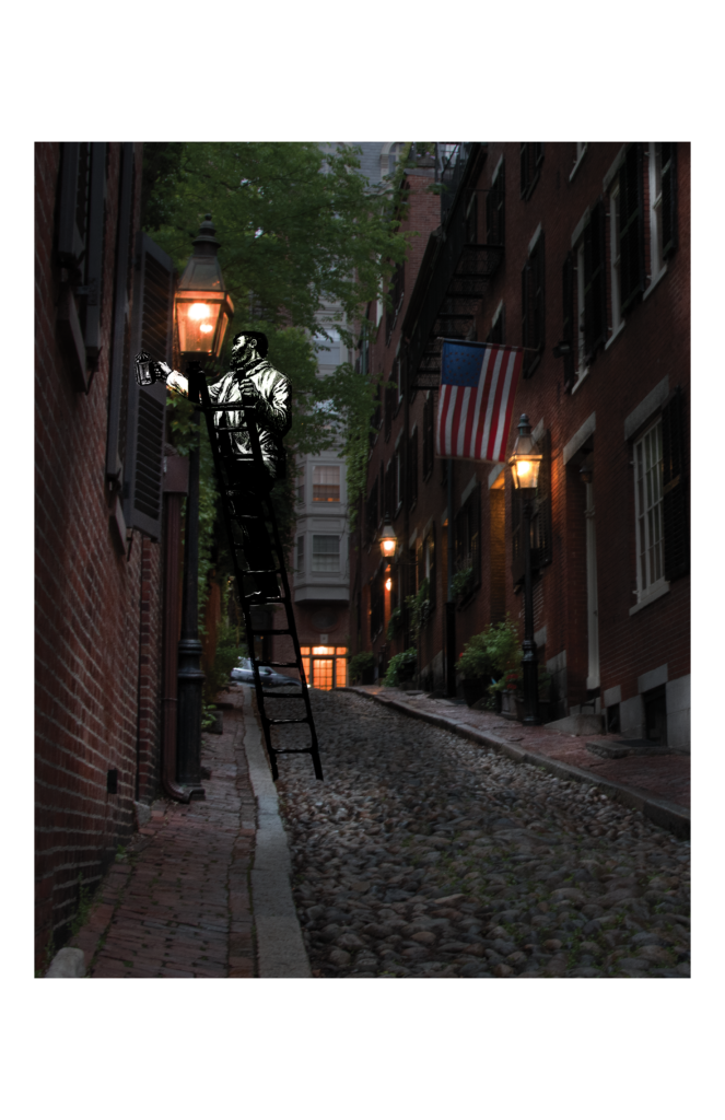
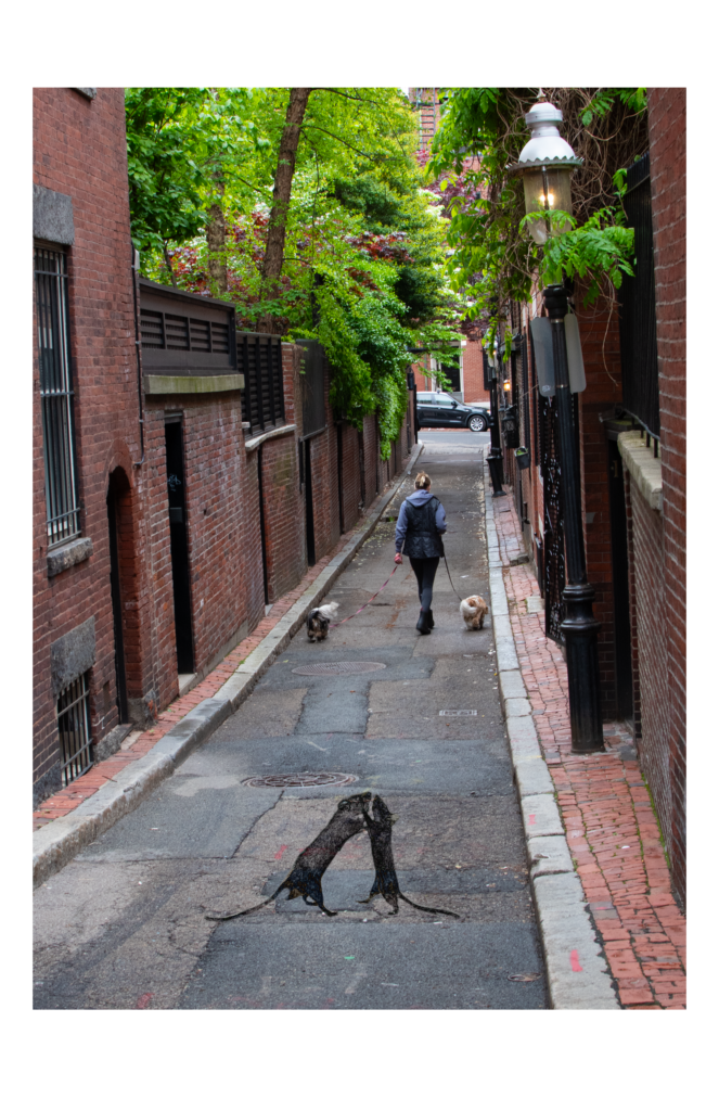
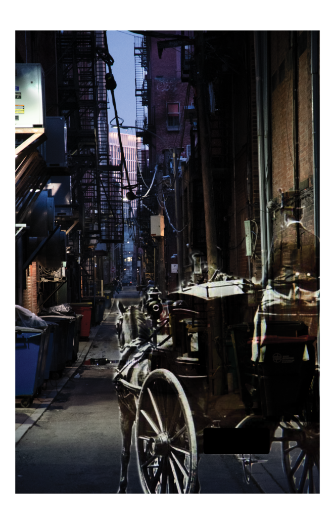
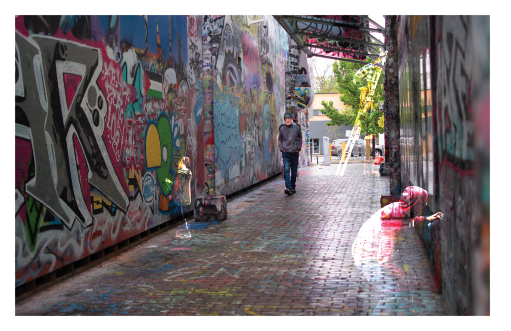
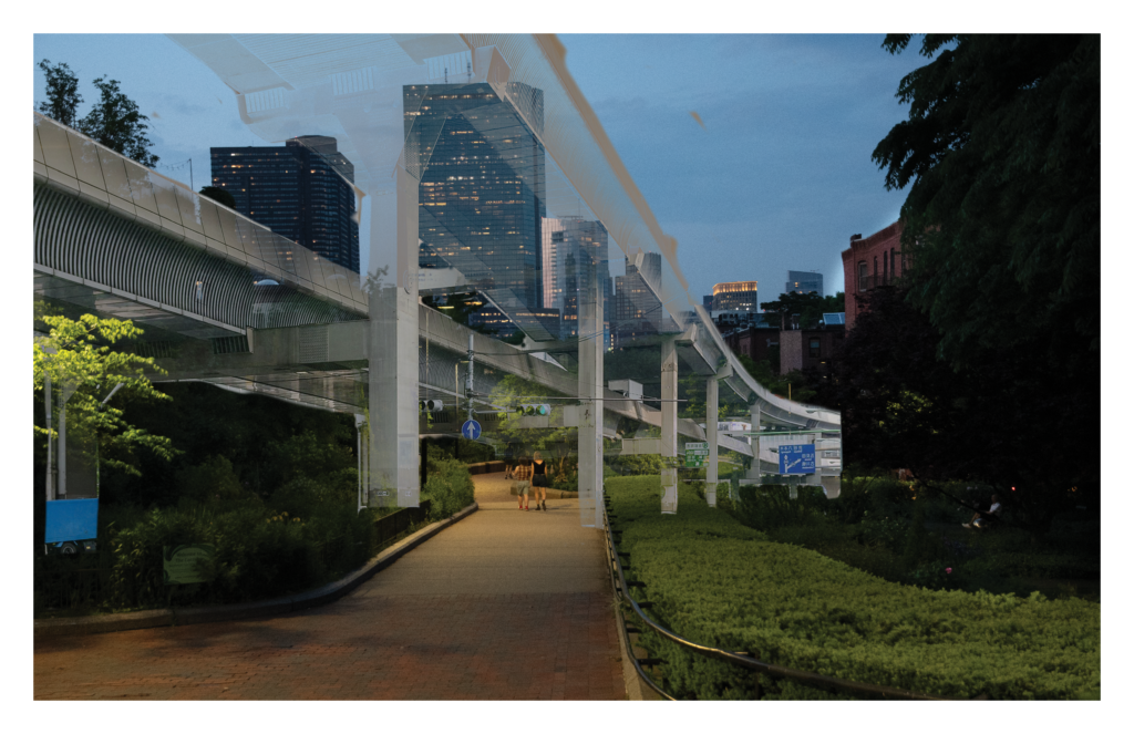
Liminality: Make a series of photographs reflecting on liminality. What does it mean to be liminal, marginal, on the fringes, or in between? How can you use the camera to capture or address objects or ideas that escape recognition, definition, description, and even visibility? Consider reflecting on ideas like transparency, immateriality, distance, and (be)longing.
I chose ‘Liminality’ as the underpinning theme for this series of photographs.
The Absent Photographer: Using a DSLR or mirrorless camera, make a series of self-portraits (10-15 pictures) without physically appearing in the photographs.
Consider: How can a photograph convey parts of your identify, your character, your daily desires and interactions, without you being visible? While shooting, make intentional choices about your aperture, focus and depth of field.
Make 10-15 photographs that respond to the theme of time. How does the camera depict or resist the passage of time? How does the photograph arrest, interrupt, intervene in, or reverse time? How might it prolong or extend it? You might consider various timescales–such as celestial time, geologic time, or human time. Or, you might consider various conceptions of time–such as circular time, linear time, historical time, or the absence of time.
While shooting, make intentional choices about your shutter speed to accomplish your desired aesthetic or concept.
This assignment is meant to provide you with an opportunity to explore new conceptual ideas, while also encouraging you to make active formal decisions. When approaching your subject matter, take a moment to consider how shutter speed might alter the aesthetic and conceptual life of your photograph. Consider how choosing short or long exposure time might make a familiar scene unfamiliar, or capture a view that is inaccessible to the naked human eye. In the most successful cases, your formal decisions strengthen your conceptual intent, and vice versa.
Make a portfolio of 15 new images accompanied by a 250-300 word Artist Statement:
Images: Devise a concept, a question, or a strategy and pursue this in a series of 15 photographs. Your photographs should be drawn together by a specific conceptual or thematic idea, and should be sequenced in the order you intend for them to be viewed. Photographs should demonstrate your proficiency in making technical and creative decisions during the image-making process.
Artist Statement: Your Artist Statement is a written supplement to your portfolio. Your statement should describe your project concept, and should further extrapolate on the formal and creative choices you made. You may choose to describe your research/inspiration for the project, your objectives for the portfolio, or how you hope viewers will engage with the materials.
Photography I: Making Images (Part B)
Develop your picture-making approaches for personal expression and awareness of your role as a photographer. Weekly exercises are meant to challenge not only your camera technique and post-processing, but also your preconceptions of what photographs can be. The aim is to identify your limitations, break down some of your barriers, and expose you to new ideas and an appreciation of what photography is. Although technique and terminology will be discussed, the more important aspect of image-making is in the thinking and doing.
Make a research-driven portfolio accompanied by a 250-300 word Artist Statement:
- Portfolio: Devise a photographic project that meaningfully draws on research. Your research may be historical, geographic, archival, familial, personal, social or otherwise. It may be directed or abstract. As you devise your guiding questions, consider which photographic strategies lend themselves to the project. Consider the strategies you have available, including visual documentary, performance, re-enactment, writing, collage, archival appropriation, and more. Combine your final photographs (and texts) into a PDF portfolio. There is no required minimum/maximum number of photographs.*
- Artist Statement: This Artist Statement should introduce you as an artist. Your statement should describe the motivations and interests that drive your practice, contextualize why you make photographs, and briefly outline the creative strategies you pursue.
* Your final “product” will look different depending on the format of your research. For example, if you make photo-texts or photomontages, you might produce fewer images. If you make a photographic index, you might produce more images. Therefore, there is no minimum/maximum number of photographs required for this project.
