Certificate in Graphic Design
School of the Museum of Fine Arts
Today’s fast-paced ever-changing world relies heavily on digital and visual forms of communication. Knowledge of design practices and principles of graphic design continue to be essential tools for designers and professionals alike. In just two semesters, the Certificate in Graphic Design provides you with the practical and theoretical skills of a design professional. You will learn the skills needed to succeed as a graphic designer while mastering theoretical frameworks.
From SMFA Program Guide
Introduction to Graphic Design
This intensive course explores the potential of graphic design. We will focus on the creation of a concept to amplify content while also developing sensitivity to the relationships between typography and image, symbolism, language, and text. Throughout the course, emphasis will shift from idea generation and design theory to technical skills. Lectures on creativity, design and color theory, graphic design and letterform history and typography are a regular part of the course. There will be some use of the Macintosh computer in class to develop work. The course will focus on the harmonization of all elements of design with a conscious understanding of the intention with which elements are chosen, organized and created. The course accommodates beginners and more advanced students who are building a portfolio.
Tools: Adobe Illustrator and Photoshop.
Instructor: Matt Templeton
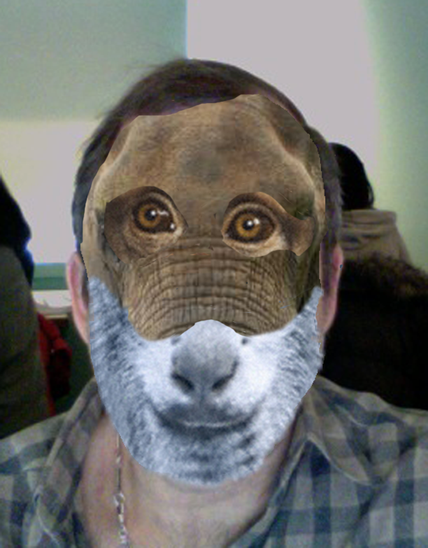
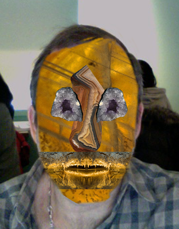
Using the examples covered in class create 3 self portraits filling the page at 8.5 x 11. Theses portraits should be cut up into thirds horizontally separating the facial features. Each feature should be from a different picture. Each feature should visually express the idea of animal, vegetable, mineral.
The objective of this project is to learn how to adjust images and collage in Photoshop and to identify patterns of organization and visual similarities in various objects. All work should have title blocks on the back and be covered.
Find a magazine whose cover is visually interesting. Replicate the design elements of the cover while including content of your creation.
Graphic translation focuses on the creation of an image with the visual means of abstraction, reduction, and interpretation with point, line, plane, shade, and shadow. Graphic translation produces images of instant recognition and startling visual interest.
Select an object, source a photograph of that object that appeals to you, then create a graphic translation of the object that abstracts the essential features of the object in a recognizable form.
Color Photography and the Digital Darkroom
This Adobe Photoshop-based course offers a technical and creative introduction to the use of color, color theory, digital capture and scanning film or slide negatives for color photography, and is appropriate for students who have completed a foundation photography course.
You will learn how to use your digital cameras through raw processing and scanning film negatives and will also learn how to make a perfect print.
The class will spend time learning what digital technology is, and how to expose, process and resize images for proper output. Students will learn the fundamentals of color correcting, digital retouching, input and output resolution and optimizing files for printing on a variety of papers.
In this project-based class, the instructor aims for technical understanding and production as a means to develop your unique voice and vision. Class time will be devoted to working in the “digital darkroom,” looking at historical and contemporary color photography and reviewing your work. By the end of the course you will have a portfolio of finished color prints that represent the expression and resolution of a cohesive idea. You may use digital or film camera technology in this course.
Tools: Adobe Photoshop
Instructor: Christine Rogers
Select a color that interests you, then explore that color through a curated set of photographs illustrating that color.
Develop a set of curated photographs that explore the theme ‘Time of Day’.






Final portfolio: Weimaraners
Typography
This introductory course will lead to the knowledge of creating and organizing letters, words, sentences and paragraphs to visually communicate an idea, and promises to help develop your creative processes in new and powerful ways. Topics include the anatomy of letterforms, type history and classification systems, how to choose type, legibility, readability and the expressive qualities of type. Course methods include discussions and critiques, slide show lectures and demonstrations, as well as hands-on problem-solving exercises and assignments. While this is not a software-based course, there will be frequent use of Macintosh computers. This course is suitable for beginning and intermediate graphic designers or individuals developing their professional skills in visual communications. Tools: Adobe Illustrator, Adobe In-Design
Tools: Adobe Illustrator and InDesign.
Instructor: Karen Stein
Select an individual whom you find interesting. They might be an artist, a politician, an author, celebrity or other public figure.
Create a typographic portrait of this individual, using letterforms only. Choose font(s) and treatment that captures the essence of the individual you selected.
Incorporate a quotation of your selected person in your portrait in some fashion.
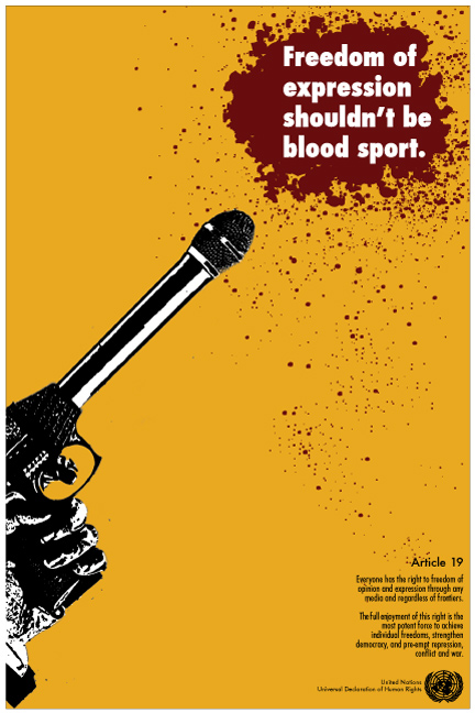
The United Nations’ ‘Universal Declaration of Human Rights’ enshrines rights that every person, regardless of nationality, gender, race, sexual orientation or any other class, is entitled to.
In this assignment, select one of the human rights included in the ‘Universal Declaration of Human Rights’ and create a poster illustrating the right.
Hierarchy is the presentation of certain elements as more important than others. By conveying a sense of hierarchy a designer provides stability, sequence and movement within a design. In the absence of hierarchy, a viewer feels lost. A determined viewer might respond by looking for subtle clues, most will move on. Hierarchy can be established by any of the following devices; position, value, form, contrast, rhythm.
In this assignment, you will create a series of posters announcing the Concert Series information included in the handout.
Rules to Follow
- You must include all of the text in each design.
- You may change the order of the text from the way it was given to you.
- You may change or eliminate punctuation and edit wording slightly to enhance communication.
- No vertical or diagonal type.
- Black type on white paper or white type on black paper only.
- You may only work with typefaces from this list when adding your second typeface. I would
suggest choosing a serif if currently using a sans serif, and vice versa:
Garamond / Baskerville / Bodoni / Univers / Clarendon / Bembo / Sabon
Gill Sans / Futura / Caslon / Meta / Helvetica
Intermediate Graphic Design
This intermediate-level course is for students who have taken Introduction to Graphic Design and seek to cultivate a deeper understanding of graphic design as a form of visual communication and as a profession while completing portfolio pieces. It emphasizes hands-on work informed by critical analysis to help students develop a repertoire of problem-solving techniques, professional practices, and efficient work habits. Class projects center on constructing integrated branding and wayfinding systems as a means to explore design’s communicative and cultural foundations. Discussions about work in progress consider the ways typography, color, imagery, layout, concept, and especially content all shape the meanings and appearance of our work — from inception to completion.Tools: Adobe Illustrator, Adobe In-Design
Tools: Adobe Illustrator and Photoshop.
Instructor: Joanne Breiner
The designs for United States postage stamps are selected through a competitive, rigorous process overseen by the Citizens Stamp Advisory Committee. The Committee’s primary goal is to select subjects of broad national interest for recommendation to the Postmaster General that are both interesting and educational.
In this assignment you will design a set of four postage stamps that comport to the rules and guidelines provided by the CSAC.
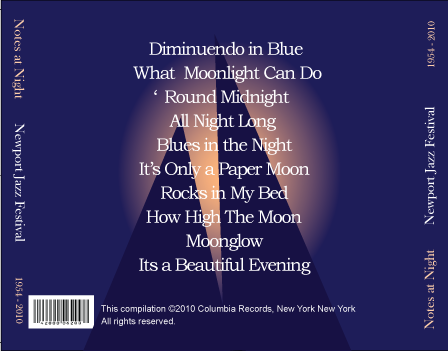
In this assignment you will create a complete CD design package, including tray liner, labels, and inserts, for a musical selection of your choice.
Think about how the design elements you choose reflect, illustrate, or expound on the musical selections contained within.
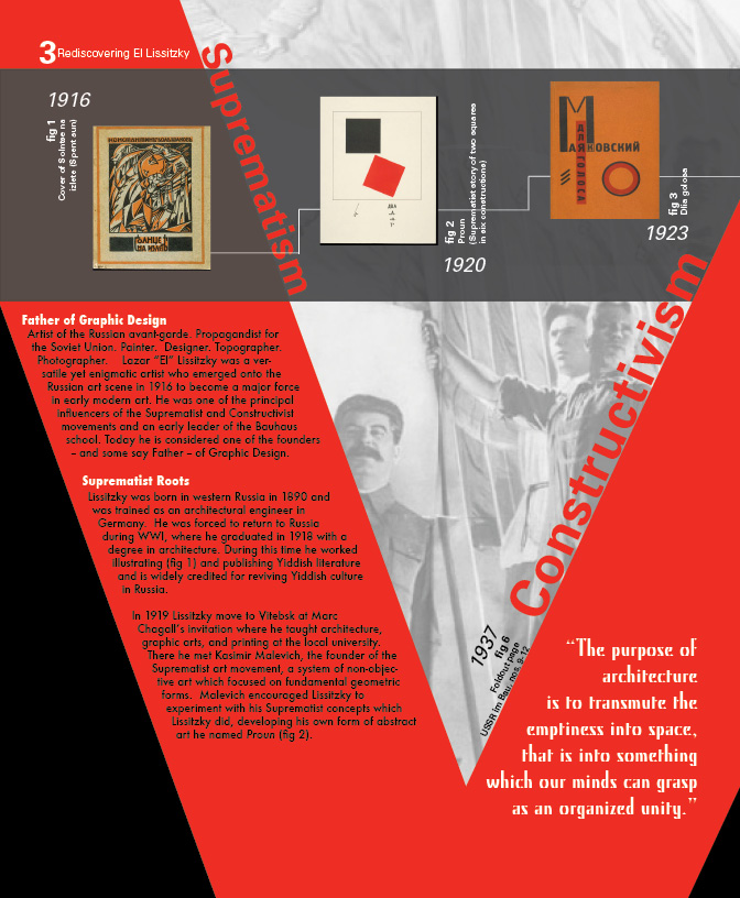
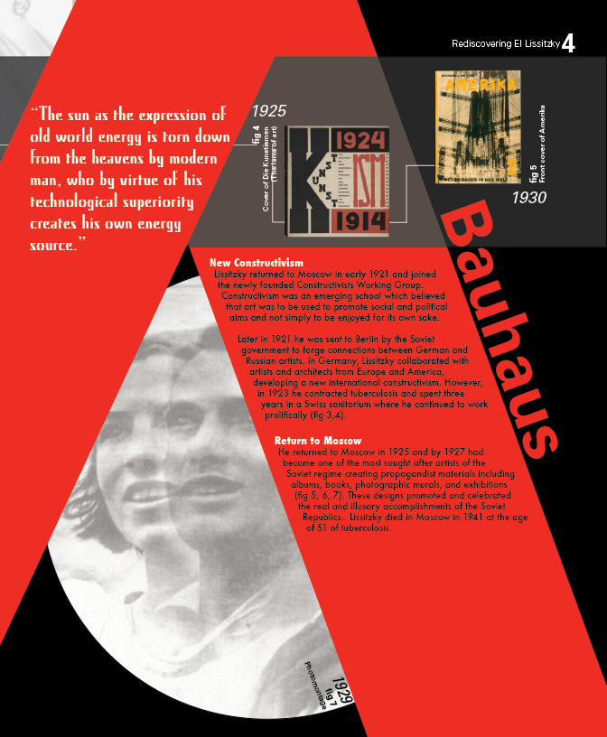
In this assignment you will create a short presentation on an artist, architect, graphic designer, or photographer of your choosing.
Introduction to 2D Design
Design is the process of selecting, organizing and processing visual elements—shape, value, texture, color and line—to express oneself in a cohesive and creative manner. You will develop visual awareness and a working knowledge of design elements by solving a series of twodimensional problems exploring such principles such as repetition, diversity, variety, rhythm, balance, emphasis, and economy. Each week you will be expected to complete an assignment exploring different aspects of design, from grid systems to biomorphic/geometric shapes, to color systems to textures, and patterns, employing a variety of media and materials, including charcoal, ink, and acrylic paint. Principles learned in this course have direct application to all media and will provide you with a foundation and direction for seeing and for learning skills in other courses.
Instructor: John Avakian
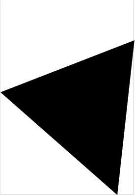
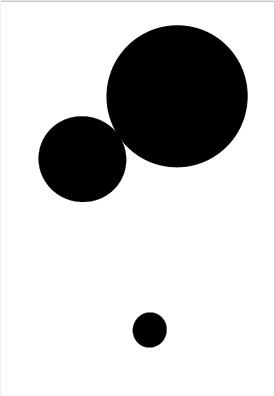
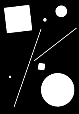
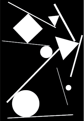
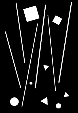
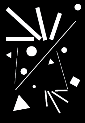
You will mount on a 15” x 20” white illustration board eight panels of equal size conforming to the layout below. The top row will have four panels each with white background. The bottom row will have four panels each with black background. You will create compositions in each of the panels with the number of shapes indicated below. Shapes in the upper row will be black. Shapes in the bottom row will be white. “Shapes” are: square, rectangle, circle, or equilateral triangle. Shapes may be tangent (eg: share one point in common) to each other or with the frame of the panel. They may not otherwise overlap each other or escape the frame of the panel.
You will mount on a 15” x 20” white illustration board two panels of equal size conforming to the layout below.
The panel on the left will have a black background and contain eight shapes: 7 geometric and 1 biomorphic. Shapes may be white or grey (you may select one and only one grey for use on this one panel).
The panel on the right will have a grey background and contain eight shapes: 7 biomorphic and 1 geometric. Shapes may be white or black. The grey may be a different shade of grey than the panel on the left. Shapes may be tangent to one another, may abut the frame, and may overlap each other. Be sure to manage values and contrast, size and scale, proximity and connectedness of the shapes.
You will mount on a 15” x 20” white illustration board a single panel conforming to the layout below. You will create a grid of 1” x 2” rectangles within the 16” x 12” panel.
Choose a capital letter from a type font and then scale, orient, and place the letterform on the grid to create an interesting composition. Color each of the resulting areas on the grid a shade from the grey scale so that 1) the letterform is clearly visitble in the resulting composition, 2) the grid is clearly visible across the composition and 3) the resulting composition is interesting.
Digital Collage
In this course we will explore techniques and methods for creating digital collages using Photoshop. Each session will start with a demonstration of techniques I use in creating my digital collages. Then, you will have an opportunity to practice, replicate, and build on the techniques you are introduced to. I will supply images but you are welcome to bring your own as well. You will be responsible for completing a final project which will involve creating a digital collage of a well-known painting or image of your choosing from images you source online or from your personal portfolio.
Instructor: Fran Forman
You will mount on a 15” x 20” white illustration board eight panels of equal size conforming to the layout below. The top row will have four panels each with white background. The bottom row will have four panels each with black background. You will create compositions in each of the panels with the number of shapes indicated below. Shapes in the upper row will be black. Shapes in the bottom row will be white. “Shapes” are: square, rectangle, circle, or equilateral triangle. Shapes may be tangent (eg: share one point in common) to each other or with the frame of the panel. They may not otherwise overlap each other or escape the frame of the panel.
Select a well-known painting and create a digital collage of it using only photographs of actual objects which you can source from the web, from stock photos, or other source.


